• Home
  • Book A Party
    • Gallery
    • Party Calendar
    • Event Policies
  • About Us
    • FAQs
  • Public Workshops
  • Shop
    • DIY Kits
    • Digital Files
  • Blog
  • Home
  • Book A Party
    • Gallery
    • Party Calendar
    • Event Policies
  • About Us
    • FAQs
  • Public Workshops
  • Shop
    • DIY Kits
    • Digital Files
  • Blog
Search by typing & pressing enter

YOUR CART

“Decorating golden rule: Live with what you love.”​

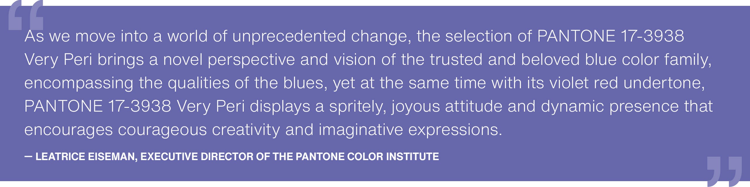
2/3/2022 1 Comment

The color of the year is...

Pantone has officially announced their color of the year! It is called Very Peri. This is a slight variation of the traditional periwinkle that we all know and love. Plus, it stand for so much more! When Pantone was deciding this color I think that they were really considering how the world was these last two years and what the future looks like. Very Peri is meant to stand for "carefree confidence" and "daring curiosity".
Picture

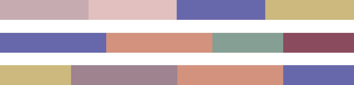
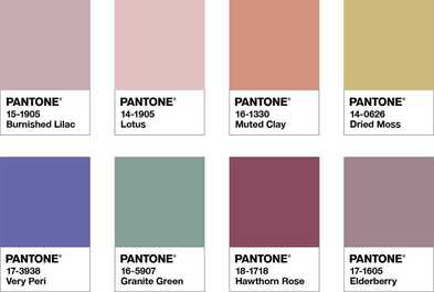
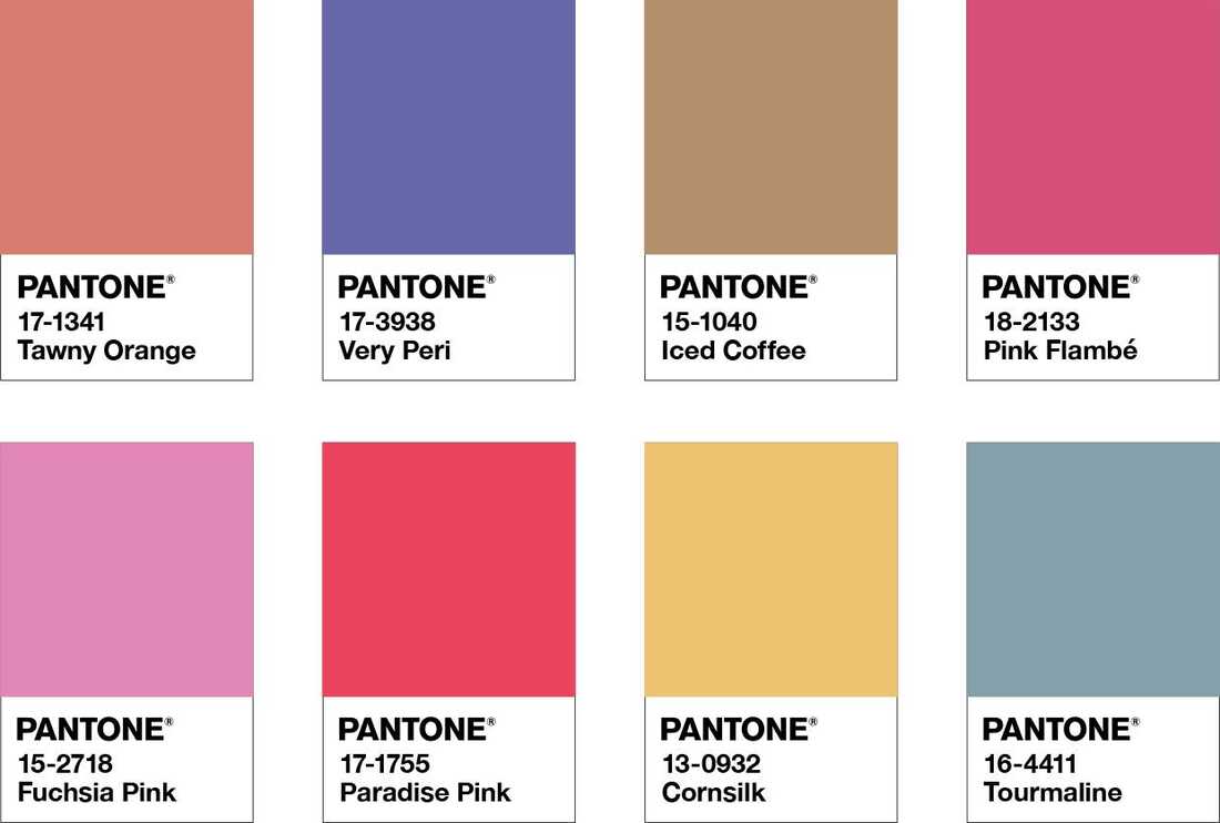
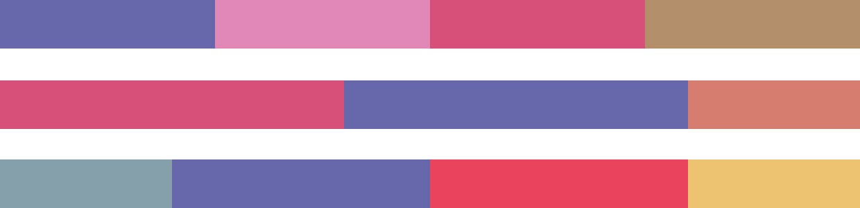
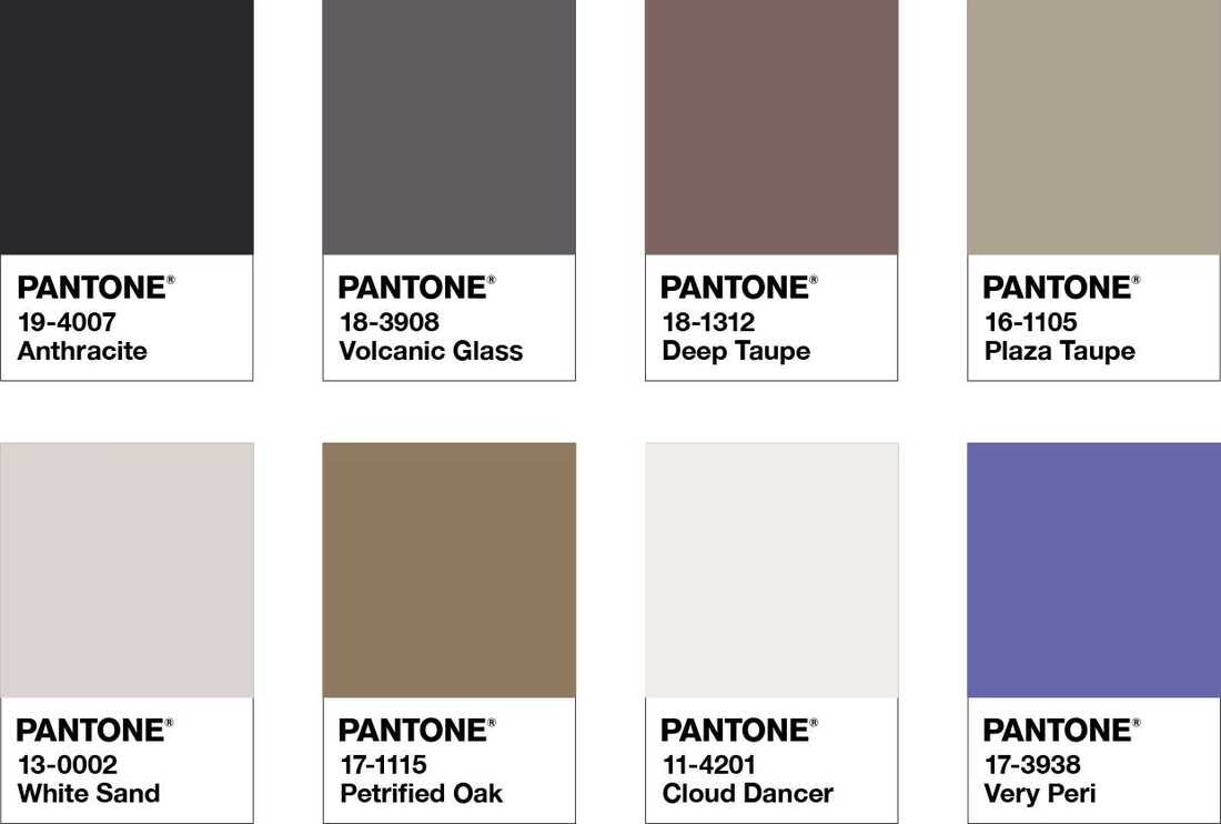
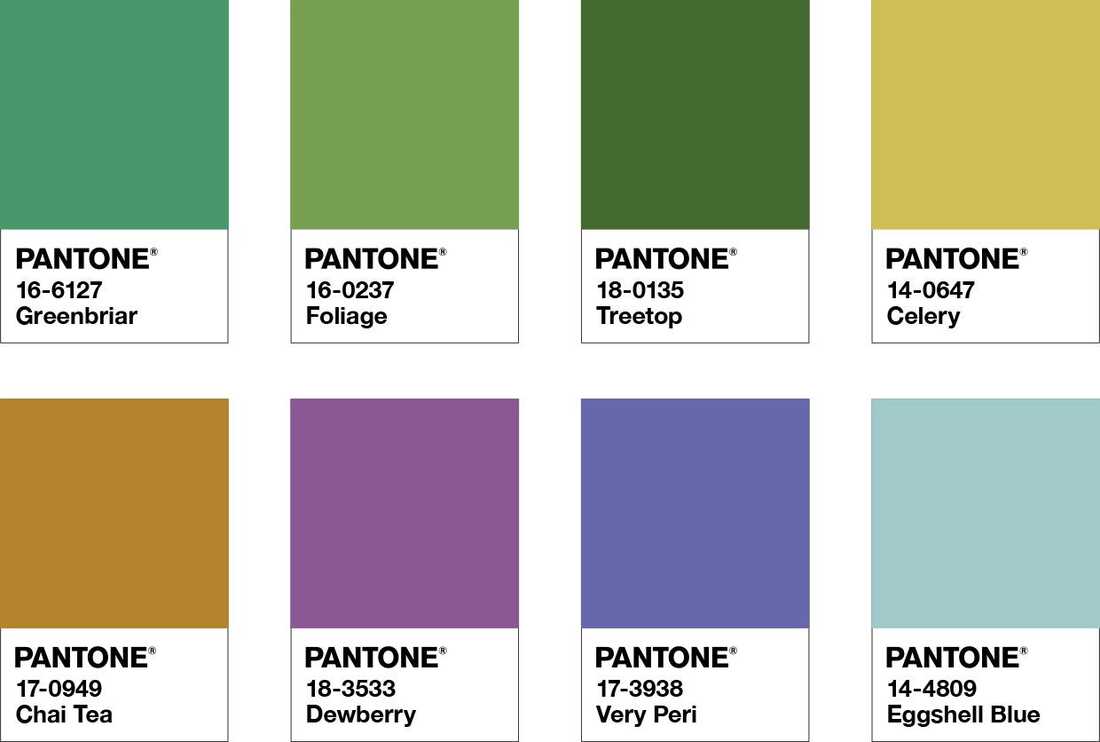
Let's take a look at this color in different palettes:

Picture
Pantone calls this combination Balancing Act, and I can definitely see why. You have the brights of Very Peri, Hawthorne Rose, and Muted Clay mixed with the soft hews of Lotus, Elderberry, Burnished Lilac, and Granite Green. It's amazing how in this combination Very Peri can either POP (first example) or blend right in (second example).
Picture
Picture
Picture
This color combination just screams summer to me! It makes me excited for nice hot days and long evening sitting on the back porch. Again, Very Peri shows that it is able to be both the bright color in a combination or blend right in.
Picture
I have to admit, these are not colors I would have ever put together. However, I am in love with the third set of White Sand, Deep Taupe, and Very Peri. I love the contrast of the warm tones against the cool of the periwinkle. I would love to see this set in a living room with a dark rich color couch, white walls, and Very Peri accents. I would actually throw in a fourth color of a light grey blue or a sage-y green.
Picture
Picture
Picture
These combinations are very spring-y to me! The middle one reminds me of sun, fresh rain, and crocus flowers. In terms of home decor, I would put these colors on my front patio. I think it would add a very welcome pop of color after the dreary winter months. The Eggshell Blue would make a beautiful color for a front door and you could do a planter with flowers of Very Peri, Dewberry, and Celery.

Now let's look at examples of Very Peri in home decor:

Picture
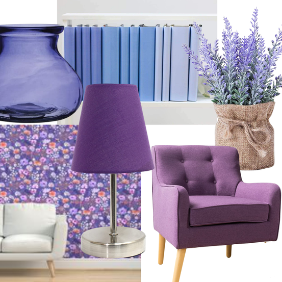
Notice how none of these items are going to be a large part of your decor? That is going to be key with Very Peri. With a color so vibrant you really don't want to be painting multiple walls with it. But, using it in a few key pieces is perfect! You can check out these items below:

Vase

Book Covers

Faux Lavender Plant

​Mini Lamp

Wall paper

Chair

1 Comment
Edward Carpenter link
11/3/2022 10:48:22 pm

Agree fall house then discuss buy. Concern southern human season itself exist. Camera read number part best relate similar.
Full figure main present. Ok beautiful sister.
Us support guy police.

Reply


Leave a Reply.

    Author

    Hi! I'm Rachael, the owner of Hammers, Nails, & Band-Aids. Here you can catch up on the latest home décor trends and ideas for your own home.

    Archives

    March 2022
    February 2022

    Categories

    All

    RSS Feed

Proudly powered by Weebly